Friday, July 31, 2009
Blogger and I are fighting
I could not get blogger to lode up my tutorial up so everybody could read it but it shows up perfectly on deviant art in you full view it so it is here http://SuperJMan.deviantart.com/art/Tutorial-131566823

Thursday, July 30, 2009
Final Tutorial
I am almost done with it and it should be up before the weekend. The piece is not complete but i feel that i have used all the tools i have gained over the class to create a decent tutorial. I hope that it turns out to be useful in showing how i work.
Tuesday, July 28, 2009
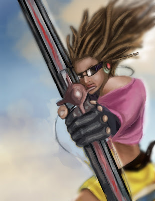
W.I.P

My second day of work is moving just as well as yesterday. I started today by creating a new layer and lowering the opacity to 50% and started building volume. I also started thinking about how extreme lighting from the lighting would effect the things around it (hammer, skin, clouds...). I began working and making color changes through the piece. By now i have about 25-30 layers. I like to at this point go through and combined layers so i can manage them better. I also for fun go through and turn layers off and on to see what it dose to the piece. Sometime i find that by deleting a layer all together makes a piece stronger. In this case it worked i believe. I found that having some of the flat wight from the background layer gave it more of a sky feel.
Monday, July 27, 2009
New idea w.i.p

The last idea i was working on did not feel like it was working. I felt that the scene needed a lot more work then i was willing to commit to it. The idea was sound but the figures were not energetic enough for me to want to continue with it. Whil i was sleeping i came up with a much more dynamic composition. I also switched the character focus to Thor and Jörmungandr.
The start of this pice was the background. I picked a blue and green and created a gradient.
Then i when in on two different layers with a custom cloud brush and created a vortex pattern that
would create a focal point. I then created a new layer and just started sketching to see how i would
lay the figures in the composition. After I figured the posing I used the selection tool to block in the
base colors. Thats what i did today. Tomorrow i am going to start to build form over the base shaps
and start in on a light source
Sunday, July 26, 2009
Last week of class

For the last week of class I'm going to be working on a piece for cghub.com drawing jam bi-weekly challenge. The topic is Ragnarok. Here is the start at a low rez. This was done cause the site needed a smaller file to attach it to. I will post a higher rez one later
Tuesday, July 21, 2009
Reflection
Prof. Babcock told me that i should go back and reflect on my progress today. I did and felt like i have grown as a digital artist. Going into this class i wanted to improve my digital art skills and i feel like i have accomplished this. I have done studies that ranged across all kinds of art styles and feel that it has helped me grow. This is the first class that i have felt really passionate about and felt like i need to strive fore excellence in. Thats why i have been working so hard and spending so much time working to get things done. It is my hope to carrie this on to feather classes and make use of the skills that i have acquired to have a great year in illustration. Can't wait to start the year off and show Prof. Willey and Lynch what i'm made of
Monday, July 20, 2009

Friday, July 17, 2009
Interp.#5 w.i.p
So i got off work early and have not been able to sleep so i went to working on my interpretation. Things are going to alot faster for some reason. I spent one and 1/2 classes on one figure and now all of a sudden i have to more characters done. I think it needs to be tightened up better but you won't be able to see in the blog. Can't get my images to open in the larger window. I think i'm going to call it quits for the night though.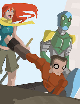
Thursday, July 16, 2009
Interp.#5 w.i.p
I still have alot to do over the weekend but i have one of the figures mostly realized and the composition worked out. Like i said i have alot to do but it should be pretty far along before the weekend is up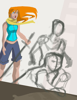
Wednesday, July 15, 2009
Master Study #5
For this pice i made the line art on a layer and on a layer underneath it i just colored in the shapes. It was a simple study and more monotonous then challenging 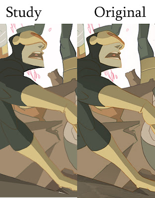
Interp.#4 corrections
fixed the thumb and could not stop so i kept working on it for the first part of class. Working on my master study now and will post it before midnight.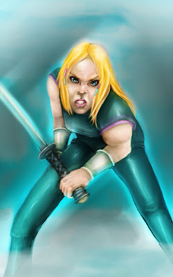
Tuesday, July 14, 2009
Master Study #5 image
My next master study is by Sean Galloway. He is a comic book artist that has worked on the comic for TEEN TITANS GO and did all the character design for the cartoon show the Spectacular Spider Man. I chose this pice cause it is a good example of his art style (that and i have been wanting to do a master study of a X-Man for awhile :) 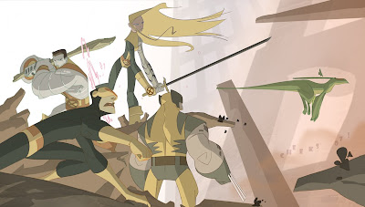
Interp.#4 Final
Ok so even though i fell the pose is funny looking i got what i was looking for from my study added to my skill set. Alot has changed from yesterday and i feel that it is closer to complete. 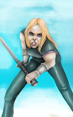
Monday, July 13, 2009
Interp.#4 w.i.p. Day 1
Started in b&w and made a overlay layer to block in most of the color. I found to much easier to make the gradients this time around. Guess i just needed to do a trial and error to see what works best.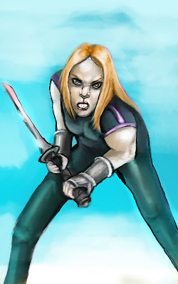
Sunday, July 12, 2009
conceptart.org challenge
I don't know if anybody is interested but there is a contest going on on conceptart.org. Alot of the details are on this site but it seems like fun. I think i might give a go at it. the topic is bring somet-hing into this world or to life.the link is : http://www.conceptart.org/forums/showthread.php?t=159819
Friday, July 10, 2009
Master Study #4
So this turned out to be a heel of alot more difficult then i thought it would be. I think i guassian blured this pice at least 20 times.
Thursday, July 9, 2009
Master Study #4 image
This is by a artist by the name of Randall Whiteis. What i like most about it and would like to take away from it is the soft tonal shifts that are made.
Wednesday, July 8, 2009
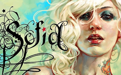
Interpretation Final
So i finally finished it, or got it to the point to were i feel ok with moving on to the next assignment. I really liked this one and on the sites i have been posting it i have been getting some good feedback. I feel that this is a style i would like to explore more and develop during my illustration classes this coming fall semester.
Interp.#3 w.i.p
I could not stop working last night. I posted what i got done in the last post but after walking away for a few hours i had nothing to do so i went back to it. I fixed the perspective on the eye and flipped the canvas so i could see any flaws. i found that part of the face was not rounded enough. i also felt that the lower corner needed to be addressed so i tried adding a hand. it did not work out so i switched to some strands of hair. it looks better but i still am not done with it.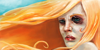
Tuesday, July 7, 2009
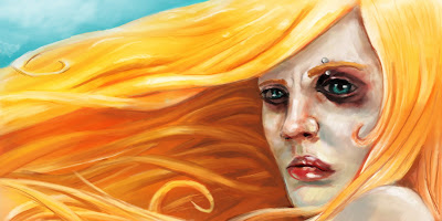
Interp.#3 w.i.p day 2
Played around with different brushes. Changed the background and hair color. I also made the blues and greens more prominent in the face. I like how it is turning out alot more then my last project. i am learning alot using this style. I like it alot more then what i usually do.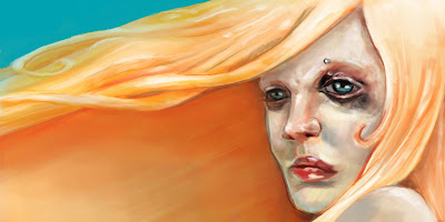
Monday, July 6, 2009
Interpretation #3 part one
So my camera was not working and i could not get the person that was going to model for me to stay to paint from life so i just started sketching right into photoshop. I started by drawing in black and wight and built the color over it. It helped with values but i still changed a lot as i added layer over layer. This is just the first part so any suggestions would be great. I was thinking i might try experimenting with some type like the original has.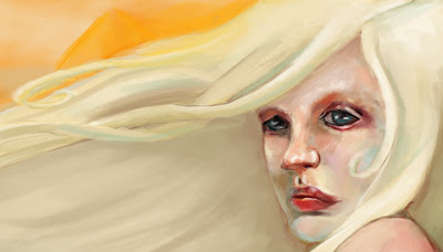
Saturday, July 4, 2009
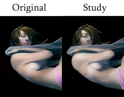
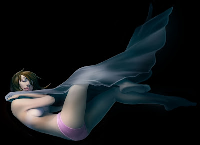
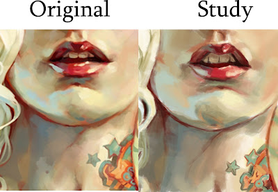
Final Interpretation and master study #3
This is my final for my interpretation of my second stud. I brought some of the things that were to out of focus back into focus and worked on the sleeve some more.

My third master study came from a artist named Anton Lavrushkin
What i wanted to take away from this piece is the use of other colors then just pinks for flesh tones. Using blues and orange to make my study was kinda fun. It definitely gives the pice a different
Thursday, July 2, 2009
Interpretation part 2
I don't know it this is working any better but i used some soft brushes to blend some of the values. I think i overdid it a bit though. I also tried re-working the fold in the arm but i'm not sure its right as well. I think i'm going to have a friend model for me tomorrow and see if i can nail it in.
Subscribe to:
Posts (Atom)